18. Text: Aggregations
Text Recap of the Previous Video
Aggregation and Granularity
Let's start making some more complex plots. The first thing we'll do is create a simple scatter plot to see how some measures are related. I expect that the more items sold, the higher the profit will be, so let’s look at profit vs quantity.
Try it out yourself. You see just one point! What’s going on? Why isn’t there a point for each record in the data set?
Aggregation
When I was first learning Tableau, I couldn't understand why I was only seeing one point when I thought I'd see a bunch of points. The answer is how Tableau aggregates the data. You should see in the pills that Tableau is taking the sums of Quantity and Profit. This is called an aggregation. It is summing Quantity and Profit over all records in the data set, this is why you are seeing only one dot. There is one sum over all the records for Quantity and one sum over all the records for Profit.
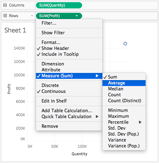
The kind of aggregation you're doing can be selected by right clicking on the pill or clicking the triangle. To change the aggregation method, select Measure then Sum, Average, Median, and others.

Granularity
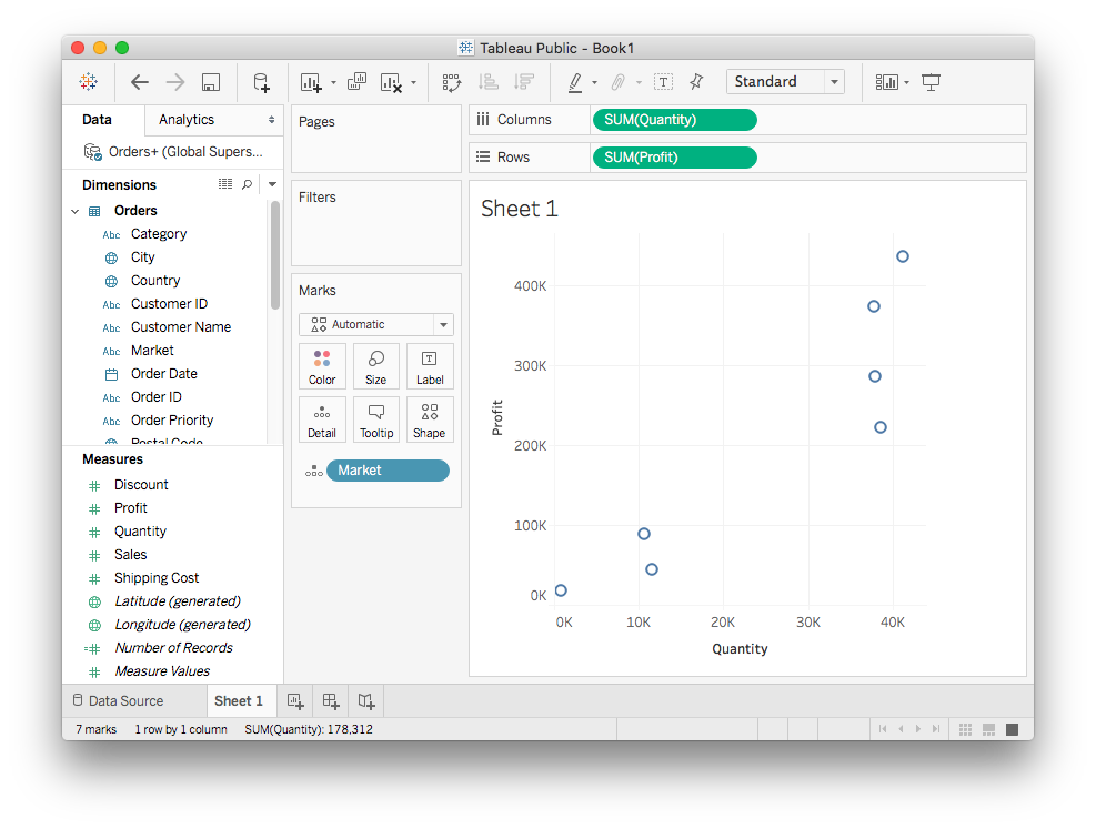
To get more points, you need to increase the granularity. That means you need to aggregate not over all the records, but over something like categories. For instance, you can drag Market to “Detail” in the Marks card.
You should see seven dots, one for each value in Market. You’ve increased the granularity, Tableau is aggregating the data over each market now. You get sums of Quantity and Profit for each one. The aggregation hasn't really changed. It's still the sum of quantity and profit, that sum is just now being calculated at a different granularity.

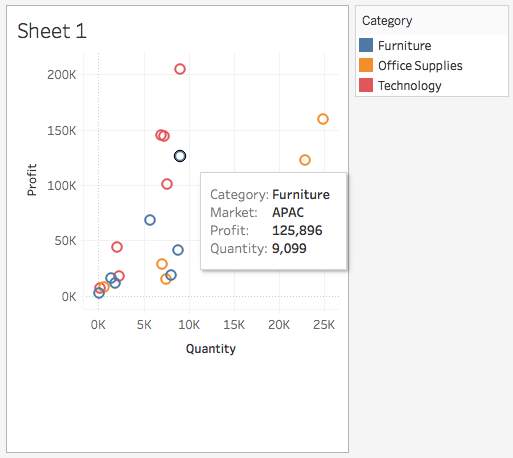
You can hover over a point to see which group it belongs to and the data values.
You can change the level of granularity by dragging dimensions to the boxes in the Marks card. The level of granularity is set by the total number of groups you have in your dimensions. The Category field has three items. Drag it to "Color". You should now you see 21 dots. Each record can be in one of 3 categories and in one of 7 markets, so you have 7 x 3 = 21 groups over all.

Now remove Market, you should see three dots, one for each item in Category. You've changed the level of granularity again, now the sums or Profit and Quantity are being aggregated over values in Category.